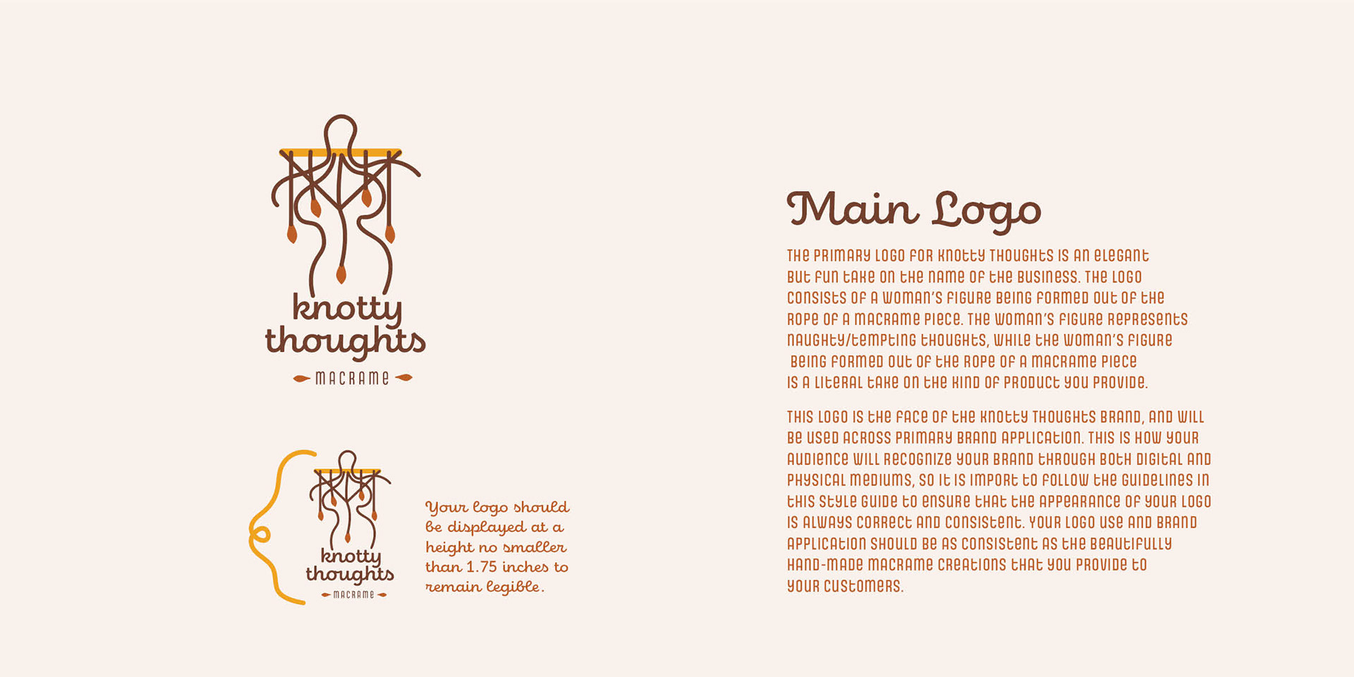
Project Goal:
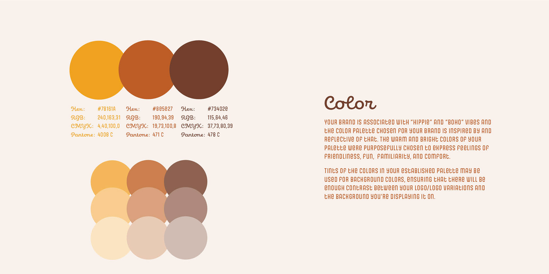
Since the business name 'Knotty Thoughts' has some innuendo to it, my client wanted her logo to reflect that while still being appropriate and attractive to everyone. She used words such as boho, creative, eyecatching, and clever to describe her business and logo.
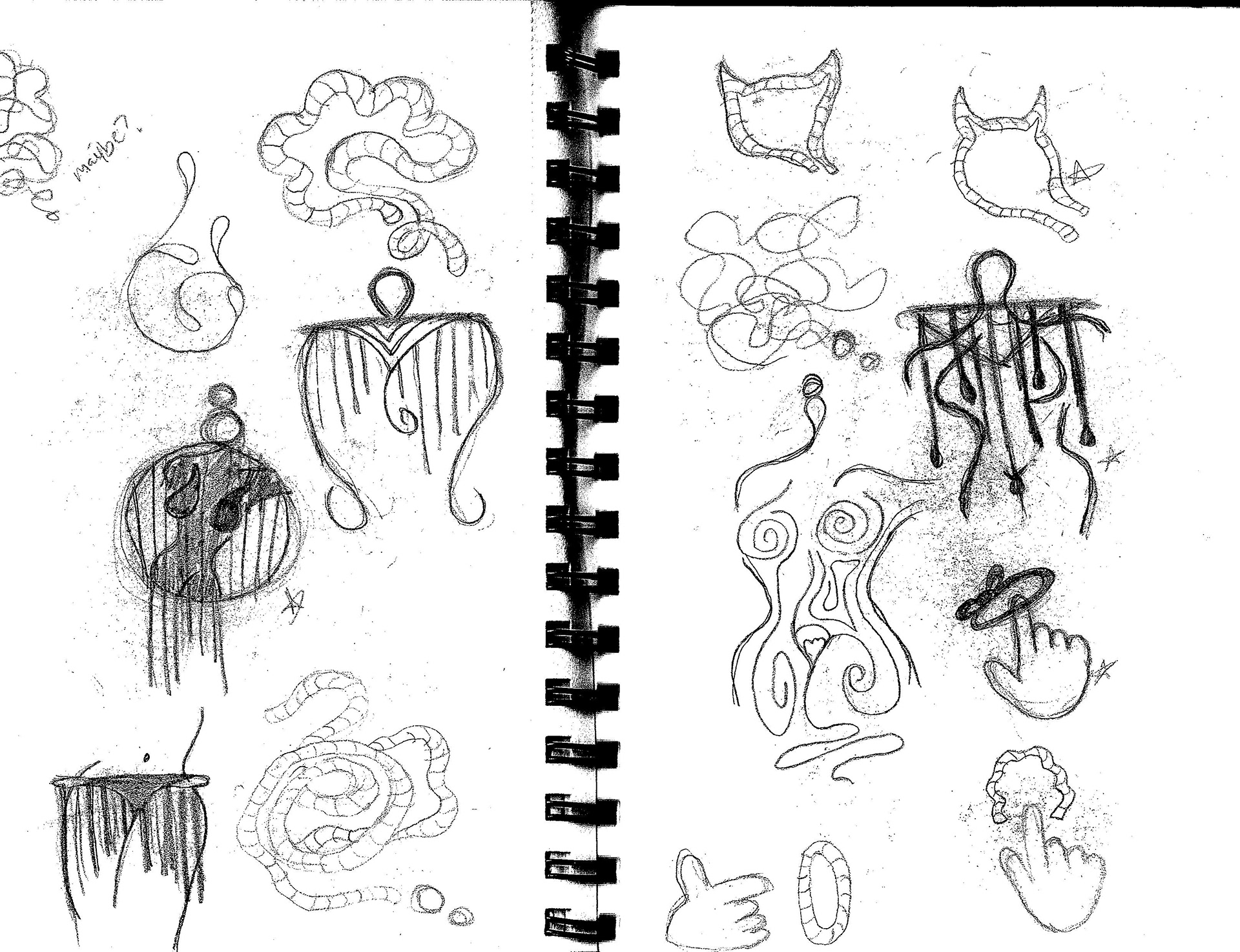
I tried to conceptualize multiple ways of representing the idea of naughty thoughts, ranging from more literal interpretations of the idea to more figurative approaches.
How Knotty is too Knotty?
The most challenging aspect of this project was dealing with innuendo and navigating my way through what people saw as overly inappropriate, versus what people saw as subtle and appropriate. While I knew creating a logo that would be seen as appropriate to literally everyone was impossible (I don't think the Amish would even like the final version of this logo), I knew it was *possible* to find a happy medium.
In order to make this happen, I knew feedback from a wide variety of others would be extremely important. I achieved this by making use of multiple social media polls both within the professional design community to just asking your average Joe. I also made use of in-person critique, gaining the perspective of family, friends, and even strangers. You can only be told that a possible logo option "looks like it's for a kink company" so much before you start to reconsider your options...

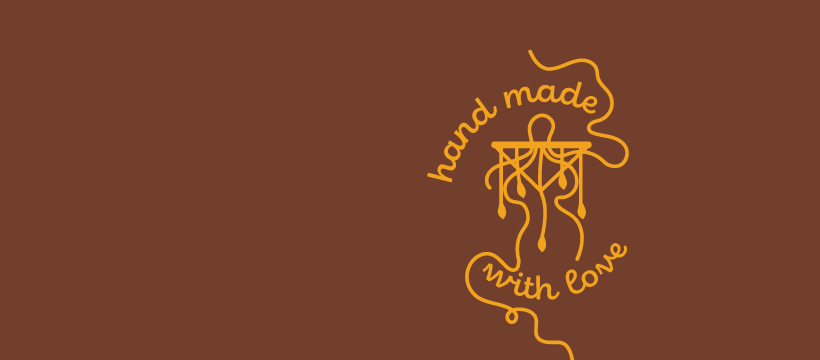
The final three logo options I presented to my client. RIP the devil head logo, it was my favorite but it was the one that kept catching the kink company comments the most so we had to give it the boot.
Final Result:
In the end, my client was very satisfied with her final logo. We both felt that the option she chose was appropriate, clever, and visually appealing to her intended audience.